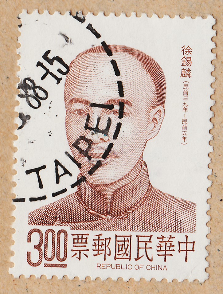
New Entries
This time I am going to focus on the Emperor Franz Joseph 1890 series and in the 1899 Queen Wilhelmina series...some new entries of these series and a few stamps from great Stamp Designers will complete this post...Last Sunday I bought a small World collection ,with a few thousand stamps, most of them from early days...the price was good , and I would regret deeply if I didn't buy it....most of the stamps are not in the best conditions, but as I said many times before , I rather have a mildly damaged stamp in the collection than it's empty place..!
------------------------------------------------------------------------------------------------------------------------------------------------------
Before starting to talk about the main theme, let me update you, with some more info about the Mouchon Subject...
I found another work of Mouchon, where a similar background was used... it is a stamp of the Sultanate of Anjouan ( issued in many other French colonies... it is part of the common designs...) issued from 1892 to 1899 and designed and Engraved by Mouchon...
 |
| pic 1 |
[2] 1892 Anjouan stamp [3] 1895 Luxembourg stamp
[4] 1895 Portugal stamp [5] 1896 Greece stamp
 |
| pic 2 |
 |
| pic 3 |
 |
| pic 4 |
 |
| pic 5 |
I
t was for me a surprise the appearance of this stamp so early in time...the background of this stamp is much more similar to the Greek Olympic stamp of 1896 , but the idea of the background of small stones remains...it is of common knowledge that the French stamp of 1900 "Type Muchon" doesn't present this background, so I have to continue searching the period from 1892 to 1900 to find more of these examples...
-------------------------------------------------------------------------------------------------------------------------------------------------------
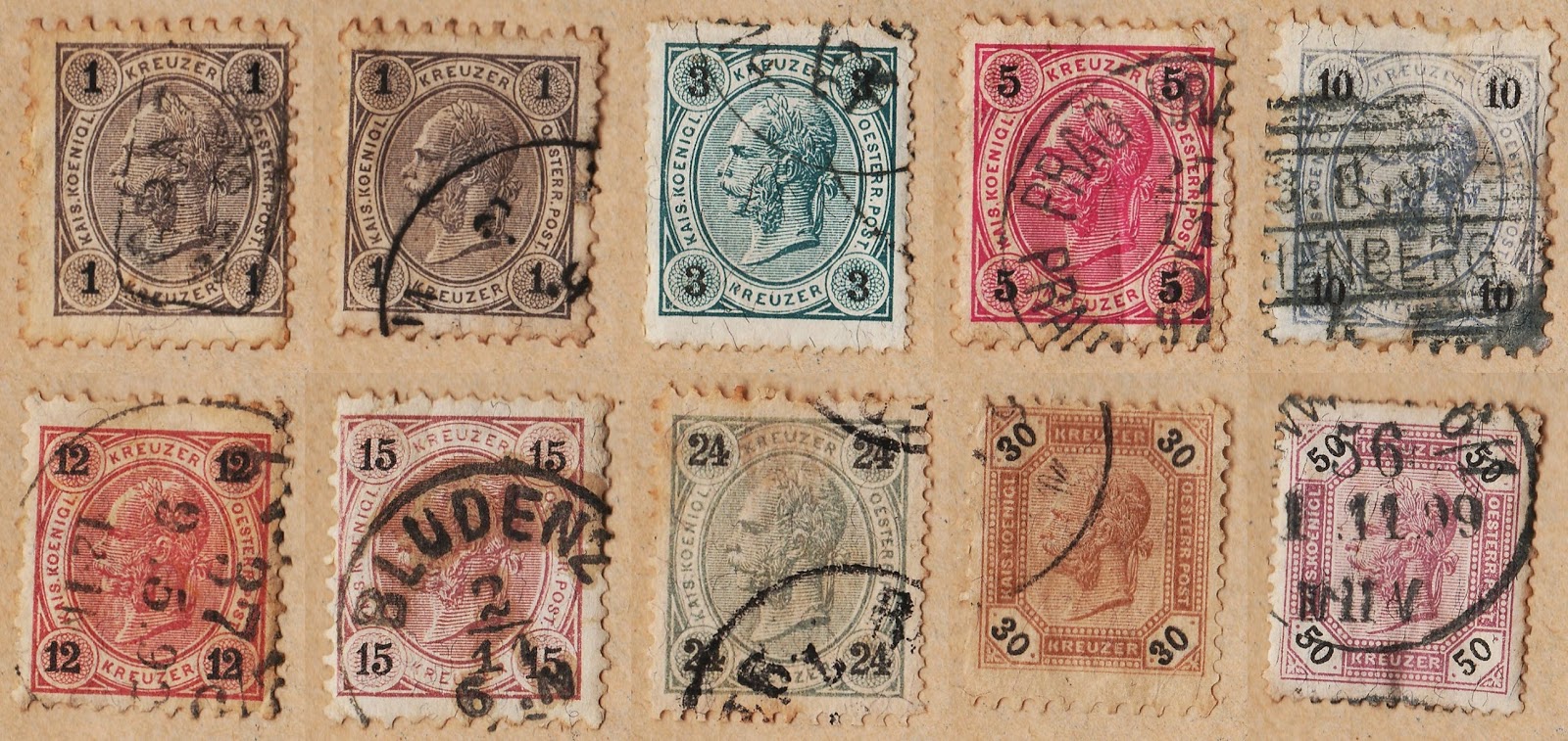
The 1890 series of Emperor Francis Joseph I of Austria is in fact a group of 4 series...the emperor's portrait is the same in the 4 series, but colors and currency define new series...These series have no Wmk , but the perforation is decisive... here is a small transcription of an old SG catalog from the 60's...
"There are about 40 different perforations or combinations of Perforations in these issues.."
The first series of this Group present us stamps with the values in "Kreuzer" (k) Currency....The values appear printed in black at the four corners of the stamp...The small values in k are [Typo] printed and the high values in g (Gulden) are [Recess] printed...
if You are a good stamp observer you will see that most part of them show us some black thin filaments at the surface of the stamp... I don't know what are these "things", but I had already stamps of this series in the collection,from other lots and they also show this filaments... below , at right, I show You an amplification of this "strange event"...
In my opinion the right profile portrait presented in the High "Gulden" values ( pic 7) is not at the same Good level of the other 2 designs of this series... it doesn't seem right to me, we just see a bad engraving, it is just .... bad..!!
 |
| pic 6 (1st Series) |
 |
| Black Filaments in the 3k |
 |
| pic 7 (1st Series) |
1890/1896 "Emperor Francis Joseph I of Austria Portrait [Kreuzer values]" (18) [Typo] Sc(51,51,53,54,55,56,57,59,60,61,62,63)
 |
| pic 9 (2nd Series) |
 |
| pic 8 (2nd Series) |
In the 2nd series, the values continued to be printed in black and at the four corners of the stamp, but the currency used is the Heller (h)...please not that the values also continue to be printed above non solid background... I've got just a small number of these stamps to show, but I want to say that in this Group of series the existence of many shades is possible... a good example of this fact is pic 9 , where we can see a much soft and light carmine, almost a color from the "Rose" family and not from that of the "Carmine's"...in this pair, we can see also a beautiful 1900 Vienna Postmark in its complete form...we have to understand that there is a small crease between the two stamps, and the perforation is hidden below it...the pair has still some some paper attached, but I didn't want to damage in any way the postmark by emerging it in water...
1899/1902 "Emperor Francis Joseph I of Austria Portrait [Heller values]" (15) [Typo] Sc(72,77,80)
I have to highlight now that from the time when the 2nd series was issued (1899) , a new security measure was taken in some printings, with the form of diagonal Varnish bars ; so the 2nd and posterior issues exists with and without these Bars...just for clarity of purposes , I must say that in this post we are talking only of series without these Varnish Bars.
To correctly distinguish the 3rd and 4th series, we must have a catalog, because some of low values of the 3rd series could be wrongly placed in the 4th.. only the catalog will tell us which are the value that belong to each one of the series...
The 3rd series could present us : 1) black values in white ground 2) White values in colored ground 3) colored values in white ground (some of those confusing stamps could exist here...remember the catalog!!.)
 |
| pic 10 (3rd Series) |
 |
| pic 11 (4th Series) |
pic 10 show us some of the stamps from the 3rd series, stamps that fulfill the 3 conditions stated above, while pic 11 show us two stamps of the 4th series, that presents only stamps with colored values under white background.
As you know , In this blog I use Sc World Catalog and SG catalogs...in these particular group of series I used the SG catalog that divided it in 4 series, but if you use the Sc Catalog ( with a more simple and general approach) it is divided in only 3 main series (the two last one's are part of a single series..)...
1905/1906 "Emperor Francis Joseph I of Austria Portrait [Heller values]" (14) [Typo] Sc(88,89b,91,97b,104)
1906/1907 "Emperor Francis Joseph I of Austria Portrait [Heller values]" (6) [Typo] Sc(90,92)
 |
| pic 12 |
Here are some stamps of the series commemorating the 60th Anniv of Emperor's Accession... it is a work of a pair of Artists that is know to these blog, with several of their works already shown... I'm talking, of course, of Koloman Moser in the Design and Ferdinand Schirnbock in the engraving...They are perhaps the most prolific and famous Team of Stamp Workers of the Beginning of the XX Century...
All the talking about this series was already done by other collectors , so I just want to focus my attention for a minute on the 1k Violet stamp... Yes, it should be a violet stamp but this exemplar is much more a blackish violet or a violet black stamp... I have already in the collection a beautiful clear Violet stamp, so one more time we are dealing with shades, the " salt and pepper" of so many of our series..!
1908/1913 "60th Anniv of Emperor's Accession " (18) [Des (Koloman Moser)][Engr (Prof. Ferdinand Schirnbock)][Typo (low values until 35h)][Recess (from 50h on)] Sc(111a,112,113,114a,115,117a,118a,119a,120,122,124)
-------------------------------------------------------------------------------------------------------------------------------------------------------------
It is now time to look at some new entries of Netherlands, particularly some stamps from the 1898 Queen Wilhelmina series...
 |
| pic 13 |
Do you know that the Vignette was designed and engraved by Mouchon ?.. Yes, it is another of his great works... A Beautiful one, a delicious left profile of the Queen...this time I used the simpler approach of Scott catalog, considering just one series, but in fact there were new values or just new colors or shades issued until 1923. Among the stamps I present there are some shades and I want to focus on the 10c value , with the two existing ones, the gray and the lilac gray stamps...
All the values are beautiful, the monochromatic and the others with two colors... but these last ones are simply a "joy to the eyes".!.. Great stamps..!. I should say that I asked too much detail to the scanner... they are [Typo] printed stamps, and the scans should have a smaller resolution... but , this time, I am currently scanning all the stamps of this new collection I bought with the same high detailed view and this allowed me to find some interesting details , even in these famous and well studied series...
I used a higher magnification for you to see them...
 |
| pic 14 (Broken Line) |
 |
| pic 16 (A dot ) |
 |
| Pict 15 (Broken Numeral) |
Pictures 14 and 15 are taken from each one of the 12.5c stamps.. in Pic 14 , there is a broken line in front of the Queen's nose (nothing unusual, except for its great visibility..) ; pic 15 show us a broken numeral in the other 12.5 c stamp...nothing drastic, I'm sure! In the last picture, pic 16, we have a small dot that is where it should not be!! it refers to the 7.5c stamp , and I think that this one I will keep as a "different stamp"...I don't know if this is some kind of known "difference" or not, because my catalogs don't talk about any abnormal situations within this series...
1898/1923 "Queen Wilhelmina" (21) [Head Des/Engr (Eugene Mouchon)][Frame Des (Knuttel)][Frame Engr (H. Raeder)] Sc(62,62, 65,66, 67,67,68,68 70,75,77)
Just a few words in the end of this post , for the Blog Background... as You surely noticed i have changed the background because I have decided to show each month a new cover from my small collection.. it is something I have started to collect two years ago, and I like very much illustrated covers .. not much for the stamp , but more for the illustration... This one is from the "400th Anniversary of the Discovering of The Maritime way to India" Series... it is a series of postcards issued in 1898 to commemorate the historical event, with engravings of famous Portuguese Artists...this time the Artist is Carlos Reis and the picture represents the Royal Palace of Sintra...
well, I've done all the "talking" for today, so I better stop....
SeeYou