Translate

Monday, October 26, 2015

Not with a lighter...

New Entries

The stamps I choose to show today are from 3 definitive series... two of them , from the British India are very common and famous... the other one , from Sarawak is not so well known...


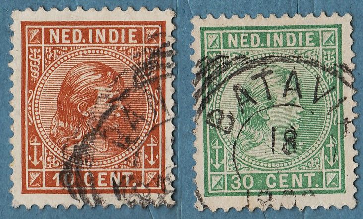
All of these 30 stamps are spare stamps ... the series was first issued in 1882 , some new values in 1892 , high values in 1895 and in 1900 5 new colors or shades...; the design itself is based on the portrait of  Queen Victoria surrounded by different frames...the portrait is one of the most common representations of the Queen and it is used in India since 1854...As you can see many colors and shades are represented , and they belong to the 1882 , 1892 and 1900 issues (I don't have any of the high values of these series...)
I have these stamps for a long time and I decided to enter them now to the collection because of the clear visibility of the Wmk...The wmk represents a Star and it is identic to the one used in the King Edward VII series...
I'm not an expert in Cancellations from this period, but I want to show something that troubled me .. it is a 4 A stamp (Slate Green) with parts of a normal cancellation from that period and a purple overprint, but not a common one ...Actually I don't know what it is...I have searched the net for articles about this subject but I didn't found anything that help me... perhaps You know and if it is the case, please comment on this post...


1st Group : Sc(36,36,56,56,36) 36 : Deep Blue Green 56: Pale Blue Green
2nd Group : Sc(57,57,57,57,38a) 57: Carmine rose 38a: Plum
3rd Group : Sc(38.38.38a,38,40) 38 : Purple Brown 38a: Plum 40: Ultramarine blue
4th Group : Sc(40,58,58,58,58) 40: Ultramarine blue 58: pale violet
5th Group : Sc(59,59,59,48,48) 59: Bright Ultramarine blue 48: Bright Green
6th Group : Sc(48,42,42?,42,42) 48:  Bright Green 42: Olive Green 42?: Slate Olive Green


There is not much more to say about this King Edward's series, that was not said about the Queen's series...The portrait is very common in many countries ruled by the British Crown, the frames are similar, the watermark is similar (star) , but there were only two issues related to this series.. the series was first issued in 1902 and in 1906 two more 1/2A and 1A stamps were issued, with similar colors...I'm not counting with Overprints and surcharges of these series, of course (Queen Victoria and King Edward..)...I will not make adtional comments to these series because they are very common and there is plenty of literature about them...

1st Group : Sc(60,60,60,60,61) 60: Grey 61: Green
2nd Group : Sc(61,61,62,62,62) 61: Green 62: Carmine
3rd Group : Sc(63,63,63?,63?,63) 63: mauve 63? violet
4th Group : Sc(63,65,65a,65a,64) 63: mauve 65: olive green 65? brown olive 64: Ultramarine Blue
5th Group: Sc(64,64,64?,68,68) 64: Ultramarine blue 64? Light Ultramarine blue 68: Red Violet


SARAWAK


Under British Protection from 1888 , Sarawak was administered as a Crown Colony from 1946 until 1963 , when it became a states of the Federation of Malaysia.. the design is the same , but above are represented 2 different series, one without Wmk (1st,2nd,3rd groups) and the other with Wmk (4th and 5th groups) .. the series was first issued in 1918 and the wmk series is from 1928... I have to say that the Watermark is difficult to see in it's totality , due perhaps to the usual and familiar Chalk surfaced paper...(however fragments of this watermark are always visible..) : the portrait represents Sir Charles Vyner Brooke, the last white Rajah of the Sarawak..
When I was scanning the stamps, I noticed that the design of the frames has some "New Art" or "Art Nouveau" influence...that I know, it is one of the few definitive series from Territories under British Protection or colonies, that presents this influence... it is a beautiful stamp, with other particularity concerning stamp Catalogs...most of these stamps present us two colors.. the problem is to know what are the indicators of that colors to the catalogs... only when You reach the 1$ stamp, You find the solution...the color of the Country Label  and the inner frame of the numerals board are the key to the correct reading of the catalog...

1)2)3) 1918 "Sir Charles Vyner Brooke" (21) [Typo (De La rue)] Sc(50,51,53,55)(61,61a,65,66)(67,69,70)
4)5) 1928 "Sir Charles Vyner Brooke" (15) [Typo] Sc(79,80,81,84)(89,90,91,92,93)


To end this small section and the post, I like to share with You 3 beautiful stamps from two series of the reigns of King George VI and Queen Elizabeth II...these stamps have a beautiful design and excellent engraving work, and this rapidly turned them into "Most Wanted stamps"... please look at them carefully, and them go buy them , rapidly...(leave some of them to me, please..!!)

1)2) 1950 "Pictorial Series / Various Designs" (15) [Recess (Bradbury Wilkinson)] Sc(191,188)
3) 1955/1957 "Pictorial Series / Various Designs" (15) [Recess] Sc(205)

A small post where I saved the best to last...Hope you like it.

SeeYou 


Monday, October 19, 2015

some Dragons

New Entries

today I have some stamps from China.. they represent several time frames from 1882 to 1963...


I will start chronologically as usual , with the first designs of the Chinese Empire ( Emperor Kwang Su 1875/1908) .. it represents a beautiful dragon,but if You watch the two stamps carefully , You will see that there are many differences between both designs...during the classification of these stamps we learn that there are 3 possibilities , depending on the paper... after a period of brief analysis I found , with great surprise , that I could correctly identify the paper... it is a relatively thin paper, but hard and strong at the same time.. it is a strange combination, but together with the fact of the design could be totally and clearly visible in the back of the stamp , it could only be a paper called "pelure paper"..so, I concluded that these are stamps from the 2nd issue of this design, from 1882.. the 1st was in 1878 and the 3rd in 1883...
I wish to say that for most of You , these are "Garbage stamps".. they are in no condition of being showed in a Blog and their value is almost zero in the 1st case and zero in the 2nd..but at the same time they are not very common stamps,and like myself, You could not yet have seen this designs in detail...that's the reason that lead me to show these first 2 stamps...the stamps are in a bad , bad state but the colors are vivid and alright and the design is correctly visible...they will take their place in my collection until better one's appear... ( these first 3 stamps .. these two and the next.... were given to me by a friend ) [ " A cavalo dado não se olha o dente " (Old Portuguese saying) ]
1882 "Large Imperial Dragon" (3) [Typo] Sc(4,5)

 this is the other stamp I was talking about...it also represents the Imperial Dragon, but in this case the design is smaller and it is different from the first...this series present a beautiful Wmk, the first Chinese Wmk, representing the symbol of Yin Yang...I show at the right this wmk because it is clearly and easily seen at "naked eye"...there are some particularities with this wmk,because it can appear with several different forms, depending on the positioning of the small circle (at the upper right , in this stamp...).. there is many,many literature in the NET about these first Imperial Dragon series... it is something I enjoyed very much reading...the colors in this stamps are very faded certainly due to external influences of moisture or even light... I don't know..it is also important for the classification of all these first Chinese stamps to take a look to the Postmarks.. they can increase substantially the value of a stamp... in conclusion, this particular field of study is a "World" of information , and stamps are evaluated taking in mind several factors at the same time.. could be complex to buy or sell stamps of these series...
There were two issues of these stamps , in 1885 and 1888.. the two issues differ in the perforation (12.5 for the 1885 and 11.5x12 for the 1888)
1888 "Small Imperial Dragon" (3) [Typo] Sc(14)


This series was issued for the first time in 1897, and two more times in 1898 and 1900/1906... in the 1st issue the label below the dragon is "Imperial Chinese Post"...well, all these 5 stamps have the label "Chinese Imperial Post"...so they must be from the 1898 or 1900 issues... if they have wmk (Yin Yang)  they are from the 1898 series.. if there is no wmk they are from the 1900 issue... in both the cases , we have 12 to 16 perforation.. (it is not a distinctive factor for these series...)... all the dragon stamps are from the 1900 issue because they have no Wmk... in the case of the 1$ stamp, representing a Bean Goose (beautiful design), the postmark called my attention.. it is beautiful and perfect... the fact is the 1$ stamp from the 1900 series was issued in 1906, so the postmark tell me that the stamp it is from the 1898 series.. the problem is that I cannot see the wmk.. I must wait for the day when a wmk detector "appears" in my house (?!?) .to correctly identify this stamp...
Another distinctive mark (much more obvious) between the 1st 1997 series and the others is the value label of the stamps... in the 1997 series the numerals are vertical and in the others they appear inclined towards the center like in the stamps I show (in the dragon stamps..).. now I want to talk a little about the designer of this beautiful series, R.A. de Villard, because after loosing some time searching for biographical data about him, I found ,curiously that there are hundreds of references to his name in the Net, linking him to the design of these stamps, but none information about his life... I can't even know for sure if he was French or German...these two possibilities exist , but in my opinion, he was a French Geographer, with the lateral skill in drawing, necessary in those days to exercise the profession, and an experienced map maker... (he is referred as the builder of the first Occidental map of some of the most important and most populated regions of China...he was also important , because he was the first owner of the famous block of 4 stamps of the Chinese 1897 3c Red Revenue stamps ; he sold  them to a Chinese Millionaire and known Philatelist  in 1927.. there is still many research to be done about R.A. de Villard, a strange man..!

[Update 02/04/2016] in this small comment about these dragon stamps, I mistakenly talk about 3 different issues... well , there is another one, from 1905/1910 , a "New colors" issue , also without wmk...(sorry for the incomplete info...)

1900/1906 "Dragons, Carp & Goose" (13) [Des (R.A. de Villard)][Recess (Waterlow and Sons)] Sc(110,111,112,113,?)


Some more stamps of the famous 'Junk' design...it is a very beautiful design issued together with two other designs forming one of the most famous , studied and collected series in the world...as You know there are 3 major printings of this series.. the first, has taken place in 1913 and it is commonly known as the London Printing, with Engraving and [Recess] printing by Waterlow and Sons..in 1914 we have the 1st Peking Printing and in 1923 the 2nd Peking Printing... all of the 16 stamps presented are from the 1st and 2nd Peking Printings.. i don't want to enter in unnecessary details about the series... next time I have stamps from the 3 printings, I will lightly focus on the differences between each one stamps...no Sc codes , also.. (these are just stamps that exists already in the collection, so there are only a few new shades of some values...)


Here I have some stamps representing the President Sun Yat Sen , one of the personalities most represented in stamps (with several large series...)... the stamps shown are from 3 different series, and the last stamp is not from the president , but from the "Martyrs of Revolution" series...1) 3 stamps from the 1st series representing Dr. Sun Yat Sen.. the series was issued in 1931 and has [Recess] printing of De La Rue (excellent work , as you can see..) 
1931/1937 "Dr. Sun Yat Sen (1st Series)" (7) [Recess (De La Rue)] Sc(290,292,293)
2) 2 stamps from the 2nd Series from the President... it was issued at the same time of the 1st one , but the design has a small ,very clear and obvious difference.. (the small sun at the top of the portrait of Dr. Sun Yat Sen has in this 2nd series a shaded inside circle.. it is very clear when You look to the pictures...these two stamps were already in the collection.. different green shade...no Sc codes..
3.1) An issue from the Northeast Province, dated 1946/1947... I couldn't find the right Sc code, so I show here the Michel (35 NEP) I use sometimes to classify Chinese stamps...
3.2) 1932 "Martyrs of the Revolution" (12) [Engr (De La Rue)][Recess (Bureau of Engraving and Printing, Peking)] Sc(319)


We now enter in the domains of the People's Republic of China , with this series honoring Mao Zedong and the Chinese Communist Party...it has a good engraver work and it is one more work of the Master Designer Sun Chaunzhe..he started to design stamps in 1947 and ended in the 70's and he is for sure one of the most prolific stamp designers of the world...this series, particularly, troubles me , because there are two issues, the original and the reprint, and unlike other cases, there is no distinction in the design between them.. it is a difference in the properties of the papers used in the printing that determines if we have an original or a reprint , and I cannot identify it correctly.. (comments are welcome, as always..)..
1951 "30th Anniversary of the Chinese Communist Party" (3) [Des (Sun Chaunzhe)][Engr (Wu Jingtang)][Recess (People's Printing Works, Peking)] Sc(105,106,107) ??


This is the first series of a Group of 5 called "Glorious Mother Country" .. these series focus on several important aspects of Cultural China...the first two series of this group are about the mural paintings of Dunhuang... it is curious that this designs are much more beautiful and appealing if we see the stamps in detail.. in a first view of the stamps, the drawings are not very appealing , but the engraving work done here  by Kong Shaohui increase very much the quality of the stamps...I challenge You to see first the stamps in this small format and then clicking above them see the pictures in detail...
Despite the fact of the following series of these group have distinct subjects , the presence of just one elaborated frame at the right ( it could appear also at the left, of course...) of the picture is common to all the 5 series...
1952 "Glorious Mother Country / The Dunhuang Murals (1st series)" (4) [Des (Sun Chaunzhe)][Engr (Kong Shaohui)][Recess (PPW,Peking)] Sc(151,...,154)


I think I have already shown the [left] stamps from this beautiful series... the only real new entry to the collection is the [right] stamp that show us the inauguration of the Highway, with the festive surroundings, flags and sheering crowd , so often represented in the China stamps from the 50's...This series is designed by another important Chinese Artist , in focus mainly during the 50's and 60's-- Lu Tianjiao --..these are for me examples of the very good stamps China has to offer us in the 50's... this time frame is my favorite and I have already many, many stamps from those days, but my real goal, is to have them all... this is not a distant goal, but others that I have are almost impossible to achieve , like that of the stamps issued in 1967... Do You imagine the amount of money I need to get all the 1967 stamps from China ??? it will be possible only  if something very strange happens..!!..
1956 "Opening of Sikang–Tibet and Tsinghai–Tibet Highways." (3) [Des (Lu Tianjiao)][Engr (Kong shaohui)][Recess] Sc(287,...,289)


I don't have many China stamps from the 60's ... I know that there are very beautiful series, sometimes large series, but from this small sample I have to offer, I cannot have a good feedback... specially the 2nd series is simply awful.. the design is excessively simple, the colors are out of place and the last stamp ( from the same series..) is very, very bad..! I already had the the 22f from the 'Horses' series.. these are two examples , now in reverse, of something I talked about earlier in this post... these stamps are much better if We don't see them in detail...!! I challenge You again to verify this fact...   
1) 1961 "Tang Dynasty Pottery (618-907 A.D.)" (8) [Des (Lu tianjiao)][Photo] Sc(592,...,595)
2)3) 1963 "GANEFO Athletic Games, Jakarta" (5) [Photo] Sc(732,...,736)


I hope you liked this post.. this time I had more talk than stamps,but sometimes it happens...


SeeYou


Sunday, October 11, 2015

what about the colors..??

New Entries

The preparation of a new post is always quality time , spent with the classification of the stamps and imagining the points I must  focus and where more detail will be needed... In each post  I often choose to talk about a topic related to our hobby, my convictions and ideas about it and above all my worries and "bad dreams" about the future of stamp collecting...I think that in the end this is a desirable section of the post , the more personal view we are expecting of a blog, that in it's "genesis" is nothing but a vehicle of the author's thoughts...today I will dedicate this section to something that I mentioned many times before.. the colors and my difficult approach to it's correct use in the classification of stamps... to do so , I will start by listing the colors assigned by two of the major catalogs, to the same group of stamps ( stamps that will be shown later in the post...)

SG Catalog ] 3f) blueish violet & reddish Purple 5f) deep blue green & deep violet 10f) blueish green & deep purple 12f) sepia and carmine 15f) vermilion & brown 20f) deep gray green & blue 50f) scarlet & deep blue 100f) greenish blue & myrtle green
Sc Catalog ] 3f) deep plum & violet blue 5f) violet & dark green 10f) purple & green 12f) carmine rose & sepia 15f) deep brown & rose red 20f) deep blue & dark green 50f) dark blue & deep rose 100f) dark green & deep blue

 First I will start by saying that SG lists first the color of the vignette and then the frame color and Sc catalog do exactly the opposite ( frame color first, vignette last..)..
If we start looking to this small list ( I could find many, many more examples...) we see that the two catalogs , seem to talk different languages... what is 'deep' in some cases, is 'dark' in others, sometimes we see a scarlet red , others just red, scarlet in one case, deep rose in other... Well , this don't look right to me !!!! and it look's even worst when we see that in Countries like the US, for example,the classic stamps are classified and valued sometimes only by the color.. are the experts in US stamps better than the experts that made our catalogs.. what is a deep blue??? what is a dark blue ?? I don't know anymore (!!??..) , and I do sincerely think that something should be done to assure the universal correspondence of colors between catalogs.. I don't know if this particular subject is of your interest, but after the presentation of this small list , it sure is of mine..! [ like in life itself, one language is better than several languages..!]

Let us now show some stamps , like usual...
I have a very small group of 5 or 6 stamps of the Dutch Indies for a long time , and I think now is good as any other time to show them..

[Left] a nice design representing Queen Wilhelmina in her Infant days... 
1892/1897 "Queen Wilhelmina" (8) [Engr (E. Schilling)][Typo] Sc(23,28)
[Right] another 'touch' of Mouchon's Art... this is for me one of his best works, together with the King D. Carlos I of Portugal stamp...in this stamp his work was restricted to the portrait of the Queen itself, with design and Engraver work signed by him...this particular stamp was issued in it's original form in the Netherlands and Surcharged for use in the Netherlands Indies...
1900 "Surcharge on 1898 'Queen Wilhelmina' Netherlands Stamps" (7) [Engr (Queen's Head designed and engraved by Eugene Mouchon)(Frame designed by Knuttel and Engraved by H. Reader)][Recess] Sc(34)


[Left] the presence of Palm Trees is common in definitive stamps from these days and from this region.. they were used also by King's George V and VI , rulers of the British Empire, in the stamps from Malaya...I think the stamp would have much to gain if there was some kind of background in the vignette, there is too much white space in the overall design...in this series we must look for the perforation because it could change in some values (perforation varieties..)
1914 "Queen Wilhelmina" (37) [Engr (D. Harting)][Recess] Sc(131,133,134a)


IRAQ
------
I have many stamps from Iraq to present ,some of them from the Saddam Hussein days, but I was experiencing some difficulties with the Sc codes...initially, this post was meant  to be done only with Iraq's stamps, but Yesterday I change my initial thought..


The person represented in all these Iraq stamps I have to present today , is King Faisal I.. this particular design could be mistaken with others of different  facial values and colors.. the difference is that this one has a very low cv and the others a very high cv.. as usual , all the Artists who gave their best to these quality products (stamps) are kept anonymous under the name of the Printing Company...Sad Detail..!!
1927 "King Faisal I" (1) [Recess (Bradbury Wilkinson)] Sc(14)


in the introduction to this next series , I must say that all of the Iraq series issued until 1950 were overprinted or surcharged many times...this series is not an exception but I'll show the overprints and surcharges in other posts, and our attention today goes to these two series sharing the same design and different currencies... the first one , above, has small values in Annas and the high values in Rupees.. the series is wmk and has perf 12...the 1R stamp is damaged , and I thought in just not present it , but ...  () the last stamp of this series is a stamp identical to the one presented in first place , a violet stamp with the facial value of 25R and the cv of £550 or more..
1931 "King Faisal I" (13) [Recess (Bradbury Wilkinson)] Sc(15,...,23)


in this second series, all the aspects (Wmk, perf) are similar to the first , except in this one we have the small values in 'fils' currency and high in 'Dinar'.. when I was classifying the larger format stamps, I noticed that the wmk is sideways.. at first I thought of a variety or so,but in the end it is common to these larger formats stamps to have this Sideways wmk.. ( specification in the SG Commonwealth 2005..)
1932 "King Faisal I" (17) [Recess (Bradbury & Wilkinson)] Sc(44,45,46,47,48,49,51,52,53,54,55,56,57)


JORDAN
--------
I have this beautiful lot of Jordan stamps to show for some time... beautiful designs,colors and engraver work are common to these stamps...let us see them.!


 To start I just to say a few words about some difficulties that I am experiencing in the moment right before taking the scan... when You put the stamp into the scanner glass, You don't have the correct perspective to know if the stamp is or not correctly aligned.. the final result, sometimes after many attempts is that presented above.. stamps, obviously not in the right position...! this fact do not troubled me with my last scanner, because it had a piece of the machine visible through the glass that allowed me to correctly align the stamp.. but this piece is not present now in my scanner.. If it is possible a pair of scales in a 90º degree angle below the glass would be much helpful for the user to correctly align the document to be scanned (of course, I'm talking of scans taken without the Auto Scan Tool ... because I'm working with a piece of cardboard as background for my stamp..).. just a thought...
I want to say also that this is the series that I talked about in the Color section in the beginning of the post...
This series has 3 beautiful designs representing , respectively Ad Deir in Petra, the Dome of the Rock and Al Aqsa Mosque... I must mention that there are 2 series that shared these same designs ,facial values and perforations , but differ in the Wmk... the first series issued in 1954 has no watermark and this one was issued in 1955/1964 presents a wmk clearly visible without no special tools... 
1955/1964 "Sights and monuments of Jordan" (14) [Recess (Bradbury Wilkinson)] Sc(326,328,329,330,331,332,333,334)


The stamp represents King Hussein of Jordan... I think the frames of this stamp are really beautifully designed , with great detail and the result, after combining them with the Vignette , is a very well accomplished stamp..
1959 "King Hussein" (16) [Recess (De La Rue)] Sc(353,356,357,360,361,362)


Great Stamp!!!
1962 "Opening of Agaba Port" (2) [Recess (Bradbury Wilkinson)] Sc(384)


I want to call Your attention to this and to the next two stamps, that are works of  Paul Koroleff , a Russian Designer who had to abandon his country and found refuge in Lebanon.. he designed many, many stamps for Lebanon, Syria and Jordan ( also worked for the UN and other Meedle East countries...).. In my other Blog I already have a post about his work with Syrian Stamps... I like you to pay special attention in the way the sky is designed, with small dots... I don't have any data regarding the next two stamps , but  I think they are also work of Paul Koroleff..
1964 "Visit of Pope Paul VI to the Holy Land" (4) [Des (Paul Koroleff)][Litho (Yacoub Slim Press, Beirut)] Sc(384)


1964 "Meeting of King Hussein, Pope Paul VI and Patriarch Athenagoras" (5) [Litho] Sc(471,474)


 [Left] Unwmk Air Mail series issued in 1954.. the vignette represents the Temple of Arthemis in Jerash...... this series differ from the other because the wmk don't exist..
1954 "Air Mail" (8) [Recess (Bradbury wilkinson)] Sc(C8,C11)
[Right] the same series issued in 1958/1959, but with Watermark...
1958/1959 "Air Mail" (6) [Recess (Bradbury wilkinson)] Sc(C17,C21)

I hope that this small selection of stamps could somehow 'awake' some of your interest in the stamps from Jordan and Iraq... it is my wish to continue to learn more about the Jordan Philately,but the thing I regret the most in this post is the little attention I have given until now to the Netherlands and it's Colonies... I hope in the future to compensate this 'gap' in my collection.. I cannot say in my knowledge about Netherlands stamps, because I already learned a lot about it in my other blog, discovering and searching the designers life's and their Philatelic contribution...


SeeYou