New Entries
The preparation of a new post is always quality time , spent with the classification of the stamps and imagining the points I must focus and where more detail will be needed... In each post I often choose to talk about a topic related to our hobby, my convictions and ideas about it and above all my worries and "bad dreams" about the future of stamp collecting...I think that in the end this is a desirable section of the post , the more personal view we are expecting of a blog, that in it's "genesis" is nothing but a vehicle of the author's thoughts...today I will dedicate this section to something that I mentioned many times before.. the colors and my difficult approach to it's correct use in the classification of stamps... to do so , I will start by listing the colors assigned by two of the major catalogs, to the same group of stamps ( stamps that will be shown later in the post...)
SG Catalog ] 3f) blueish violet & reddish Purple 5f) deep blue green & deep violet 10f) blueish green & deep purple 12f) sepia and carmine 15f) vermilion & brown 20f) deep gray green & blue 50f) scarlet & deep blue 100f) greenish blue & myrtle green
Sc Catalog ] 3f) deep plum & violet blue 5f) violet & dark green 10f) purple & green 12f) carmine rose & sepia 15f) deep brown & rose red 20f) deep blue & dark green 50f) dark blue & deep rose 100f) dark green & deep blue
First I will start by saying that SG lists first the color of the vignette and then the frame color and Sc catalog do exactly the opposite ( frame color first, vignette last..)..
If we start looking to this small list ( I could find many, many more examples...) we see that the two catalogs , seem to talk different languages... what is 'deep' in some cases, is 'dark' in others, sometimes we see a scarlet red , others just red, scarlet in one case, deep rose in other... Well , this don't look right to me !!!! and it look's even worst when we see that in Countries like the US, for example,the classic stamps are classified and valued sometimes only by the color.. are the experts in US stamps better than the experts that made our catalogs.. what is a deep blue??? what is a dark blue ?? I don't know anymore (!!??..) , and I do sincerely think that something should be done to assure the universal correspondence of colors between catalogs.. I don't know if this particular subject is of your interest, but after the presentation of this small list , it sure is of mine..! [ like in life itself, one language is better than several languages..!]
Let us now show some stamps , like usual...
I have a very small group of 5 or 6 stamps of the Dutch Indies for a long time , and I think now is good as any other time to show them..
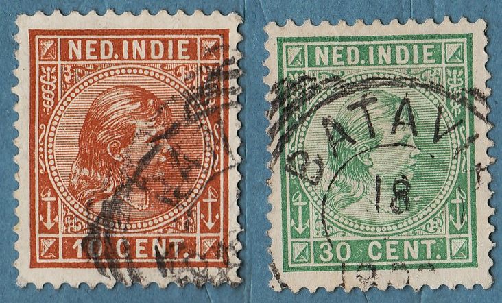
 [Left] a nice design representing Queen Wilhelmina in her Infant days...
 1892/1897 "Queen Wilhelmina" (8) [Engr (E. Schilling)][Typo] Sc(23,28)
[Right] another 'touch' of Mouchon's Art... this is for me one of his best works, together with the King D. Carlos I of Portugal stamp...in this stamp his work was restricted to the portrait of the Queen itself, with design and Engraver work signed by him...this particular stamp was issued in it's original form in the Netherlands and Surcharged for use in the Netherlands Indies...
1900 "Surcharge on 1898 'Queen Wilhelmina' Netherlands Stamps" (7) [Engr (Queen's Head designed and engraved by Eugene Mouchon)(Frame designed by Knuttel and Engraved by H. Reader)][Recess] Sc(34)


[Left] the presence of Palm Trees is common in definitive stamps from these days and from this region.. they were used also by King's George V and VI , rulers of the British Empire, in the stamps from Malaya...I think the stamp would have much to gain if there was some kind of background in the vignette, there is too much white space in the overall design...in this series we must look for the perforation because it could change in some values (perforation varieties..)
1914 "Queen Wilhelmina" (37) [Engr (D. Harting)][Recess] Sc(131,133,134a)
IRAQ
------
I have many stamps from Iraq to present ,some of them from the Saddam Hussein days, but I was experiencing some difficulties with the Sc codes...initially, this post was meant to be done only with Iraq's stamps, but Yesterday I change my initial thought..

The person represented in all these Iraq stamps I have to present today , is King Faisal I.. this particular design could be mistaken with others of different facial values and colors.. the difference is that this one has a very low cv and the others a very high cv.. as usual , all the Artists who gave their best to these quality products (stamps) are kept anonymous under the name of the Printing Company...Sad Detail..!!
1927 "King Faisal I" (1) [Recess (Bradbury Wilkinson)] Sc(14)


in the introduction to this next series , I must say that all of the Iraq series issued until 1950 were overprinted or surcharged many times...this series is not an exception but I'll show the overprints and surcharges in other posts, and our attention today goes to these two series sharing the same design and different currencies... the first one , above, has small values in Annas and the high values in Rupees.. the series is wmk and has perf 12...the 1R stamp is damaged , and I thought in just not present it , but ... () the last stamp of this series is a stamp identical to the one presented in first place , a violet stamp with the facial value of 25R and the cv of £550 or more..
1931 "King Faisal I" (13) [Recess (Bradbury Wilkinson)] Sc(15,...,23)


in this second series, all the aspects (Wmk, perf) are similar to the first , except in this one we have the small values in 'fils' currency and high in 'Dinar'.. when I was classifying the larger format stamps, I noticed that the wmk is sideways.. at first I thought of a variety or so,but in the end it is common to these larger formats stamps to have this Sideways wmk.. ( specification in the SG Commonwealth 2005..)
1932 "King Faisal I" (17) [Recess (Bradbury & Wilkinson)] Sc(44,45,46,47,48,49,51,52,53,54,55,56,57)
JORDAN
--------
I have this beautiful lot of Jordan stamps to show for some time... beautiful designs,colors and engraver work are common to these stamps...let us see them.!


I want to say also that this is the series that I talked about in the Color section in the beginning of the post...
This series has 3 beautiful designs representing , respectively Ad Deir in Petra, the Dome of the Rock and Al Aqsa Mosque... I must mention that there are 2 series that shared these same designs ,facial values and perforations , but differ in the Wmk... the first series issued in 1954 has no watermark and this one was issued in 1955/1964 presents a wmk clearly visible without no special tools...
1955/1964 "Sights and monuments of Jordan" (14) [Recess (Bradbury Wilkinson)] Sc(326,328,329,330,331,332,333,334)


The stamp represents King Hussein of Jordan... I think the frames of this stamp are really beautifully designed , with great detail and the result, after combining them with the Vignette , is a very well accomplished stamp..
1959 "King Hussein" (16) [Recess (De La Rue)] Sc(353,356,357,360,361,362)

Great Stamp!!!
1962 "Opening of Agaba Port" (2) [Recess (Bradbury Wilkinson)] Sc(384)

I want to call Your attention to this and to the next two stamps, that are works of Paul Koroleff , a Russian Designer who had to abandon his country and found refuge in Lebanon.. he designed many, many stamps for Lebanon, Syria and Jordan ( also worked for the UN and other Meedle East countries...).. In my other Blog I already have a post about his work with Syrian Stamps... I like you to pay special attention in the way the sky is designed, with small dots... I don't have any data regarding the next two stamps , but I think they are also work of Paul Koroleff..
1964 "Visit of Pope Paul VI to the Holy Land" (4) [Des (Paul Koroleff)][Litho (Yacoub Slim Press, Beirut)] Sc(384)


1964 "Meeting of King Hussein, Pope Paul VI and Patriarch Athenagoras" (5) [Litho] Sc(471,474)

 [Left] Unwmk Air Mail series issued in 1954.. the vignette represents the Temple of Arthemis in Jerash...... this series differ from the other because the wmk don't exist..
1954 "Air Mail" (8) [Recess (Bradbury wilkinson)] Sc(C8,C11)
[Right] the same series issued in 1958/1959, but with Watermark...
1958/1959 "Air Mail" (6) [Recess (Bradbury wilkinson)] Sc(C17,C21)
I hope that this small selection of stamps could somehow 'awake' some of your interest in the stamps from Jordan and Iraq... it is my wish to continue to learn more about the Jordan Philately,but the thing I regret the most in this post is the little attention I have given until now to the Netherlands and it's Colonies... I hope in the future to compensate this 'gap' in my collection.. I cannot say in my knowledge about Netherlands stamps, because I already learned a lot about it in my other blog, discovering and searching the designers life's and their Philatelic contribution...
SeeYou
Thanks so much for sharing this awesome info! I am looking forward to see more posts by you!
ReplyDeleteshop online
This is absolutely exceptional. Even though variety of article on this topic, this article carries many treasured points which had been never be read in other articles.
ReplyDeletezipcode finder