Translate

Monday, December 26, 2016

Hong Kong [2nd Post]

New Entries

Today I will only present stamps from the George VI series from 1938/1948... it presents the "simple" design adopted for Queen  Victoria and also by Queen Elizabeth....one thing You can see right from the beginning , is that the multiple CA wmk is much more visible in the lower values... in fact, the presence of chalk surfaced paper in the higher values (from the 80c until the 10$) diminish considerably the visibility without any appropriate process to see it ...
other important factor is the possible existence of many shade varieties...

there are 6  values missing ( 1c,4c,8c,15c,25c,10$) and many other varieties of each one of them... 

Let's see the stamps...


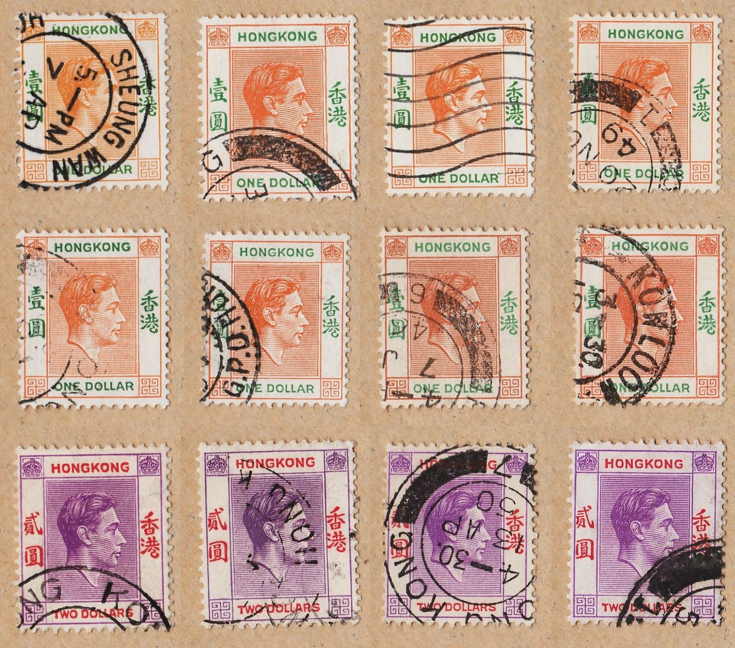
the stamps are all of the same size of course, and the discrepancy is due to the usual image bonding...In this image I show two 30c stamps , but I should have shown just one  because I've got many shades of other values that aren't presented in the image... I keep them for the next images with the spare stamps... I don't know if such thing as a "regular viewer"  exists , but some of you could be somehow troubled because I show so many spare stamps in these definitive series... Yes I show them and I keep them in the collection  because i think it is important to have as many as possible for each value , because generally in these kind of series the small detail is important and sometimes we could be surprised during our observation of the stamps...


These are the spare stamps of the values I have until 80c...despite the fact that SG only present us the 2c stamp without shade varieties, it is very obvious that we've got some more or less dark grays and some dull grays...in the 5c value we've got some dull green's , soft yellow green's and green's , but catalogs only state it as green...for the 10c , SG present us 4 varieties .. to know : bright violet, dull violet, dull reddish violet and reddish lilac...I've got here in the picture above the 4 of them and at least one more that "don't fit"...In the other hand , I don't have the 20c black but some of  the other shades of scarlet red are presented...The 30c appear in the SG catalog with two main colors and several shades : olive green and blue... only the "blues" are presented with some more or less dull blue stamps....the 50c appear as purple, bright purple, reddish purple and  deep purple...here in this image I have some of that varieties, perhaps not all of them...
it is interesting to notice that this shade differences are most notorious in the King's hair , perhaps even most than at the lined background...
A key aspect to always have in mind is that some of these shade varieties appear together with differences in the perforation... the main perforation used in this series is the 14 but  varieties as the olive green 30c or the deep purple 50c appear together with differences in the perforation or in the paper (in the 50c stamp chalk surfaced paper could be used..)


The picture above represents the spare stamps of 1$ and 2$ I have...the 1$ stamp could exist in two main color combinations: dull lilac & blue and red orange & green...a shade of yellow orange & green is also noted...in the Hong Kong stamps it is always interesting to have postmarks from particular mail stations and it is the case of the 1st and last 1$ stamps, with good postmarks...

I want to talk now about a variety known as "short leg R" that could appear in the 1$ stamps... I've got a stamp with this "strange event"  , already in the collection, but I decided to show it again, so I scanned it again, just to present now , in the right place to do it..

"Short Right Leg to R"
Normal "Dollar" Label

As you can see the right leg of the R of "Dollar" is short and somehow different from the usual one...I don't have values for this stamp because SG only show the value for MNH stamps...
well,this was a very soft view over this series, and I must remind the viewers that an expert in these stamps could write several pages about it...as a world collector , I always try to know the basic for each series , just to do a clear classification of the stamps...
In future posts regarding Hong Kong stamps I will have the remaining series of King Edward VII and George V and also updates to this and to the previous post of Hong Kong...

It is time to wish you all a Great, Great Year of 2017... I think that my next post will be already in the new Year...

SeeYou


Saturday, December 10, 2016

Sudan [3rd Post]

New Entries

For today's post I have reserved some stamps from Sudan...some Air Mail's from the 30's and 50's and a Commemorative series from the 60's...


Curiously , the first thing that called my attention when I first saw these stamps in detail , was the resemblance with the Chinese "Junk" series  with those tiny filaments gently drooping from the top label frame....in this case and after a closer view , I rapidly saw that these line are just engraving lines, not designed with that particular purpose like in the "Junk" series...
This is an Air Mail series with 12 stamps, and just one design... we can see that there are values in "m" and "p" ....in fact there are 4 values of "m" and 8 of "P" (Piastras)...the illustration show us in a first plan the statue of General Charles George Gordon ,and the desert and some palm trees in the background. it is a beautiful design with a nice engraving work...it is surely a series I want to have completed,some day in the future...
1931/1935 "Air Mail" (12) [Recess] Sc(C7,C9,C13)


Following this first 1931 series, in 1935 and 1938  two groups of Surcharged stamps were issued...the only stamp I have is from the 1938 series...I just show this stamp, to the viewer could have a better insight of the illustration and specially of all the desert landscape behind the Gordon's statue...very nice , indeed.!!
1938 "Surcharge on the 1931/1935 'Air Mail' series" (4) [Recess] Sc(C31)


I personally recommend you that this time, please click the pictures for better appreciate the illustrations and the engraving...the 2p and the 4.50p are simply beautiful..!! the illustrations and the frames are different for each value and the 2p,4p,4.50p and the 20p are drawings made with base on photographs...they were designed by someone from the printing company, and I even don't know what was it ....the 3p was designed by an Artist called G.R. Wilson ad the 2..50p (not presented here) and the 6p were created by Col. W.L. Atkinson... I have an incomplete post about him in the Artinstamps blog , but I think that with time I will discover more of his Biographical data... he is also the designer of  9 beautiful illustrations of the 1951 pictorial series already presented in the blog...I will dedicate part of today's afternoon,searching for data about his life...sometimes it is a very rewarding activity, not financially speaking,of course,but in the end it usually is time well spent....
1950 "AIR MAIL / Various Designs" (8) [Des (G.R.Wilson 3p)(Col. W.L. Atckinson 2.5p,6p)][Recess] Sc(C35,C37,C39,C40,C41,C42)


To end this small post I have a series about the efforts of UNESCO to protect some of the very old Nubian Monuments....similar series were issued by many countries, always with different designs of course...Nubia was once located in today's Northern Sudan and South Egypt...


1964 "UNESCO World Campaign to Save Nubian Monuments" (3) [Litho] Sc(164,...,166)

I think next time I will have some George VI Hong Kong definitive stamps...


SeeYou


Monday, December 5, 2016

New Zealand [3rd Post]

New Entries

Today's post is about some stamps I received last year from a "stamp friend" in New Zealand... I sent him some stamps from India and in exchange he sent me some beautiful and very famous New Zealand stamps... I already showed the "Peace" series in other previous post and now it is a good time to show the others... it will be the first of many , I hope, short posts  as I told you before..it is part of the new design of the blog , resulting from demands of my day to day life...

--------------------------------------------------------------------------------------------------------------------------

AS we all know , the different Philatelies  of our countries are consequence of their strong or weak points... some of them are known for the beautiful Engravings,other from the Fantastic illustrations, others have famous pictorial series ,others portrait series, etc... New Zealand have for a long time something called the "Health stamps" and they are among the most famous New Zealand stamps...


The illustrations and design of the stamps are work of one of the most important Stamp Designers from New Zealand... James Berry started his work with stamps in 1933  and became rapidly one the great creators in New Zealand's  Philately...his design is very fluent and versatile and these qualities brought him some well deserved fame in our Hobby's small world...
1946 "Health Stamps" (2) [Des (James Berry)][Recess (Waterlow and sons Limited, London)] Sc(B28,B29)


Here is another work of James Berry, this time with focus on the Centennial of the Otago Settlement... The versatility of Berry's work became more evident in this series,where the design of buildings is side by side with landscapes ,ships,animals,etc.. we must have in mind that there are Artists specialized in landscapes or drawing horses,or painting Naval Battles,but sometimes in the Stamp Designing it is necessary to build pictures with many of these components working together to build a coherent  idea,easily understood by the final consumer ... Us. that's why I always fought  to build my other blog... just to bring , not only people like Berry , with an extensive work in Stamp Designing,but also the work of others who distinguish themselves in other branches of Art ,but who by necessity , curiosity or to answer a professional request, were one day also part of the Enormous Group of  creators of our Hobby...
1948 "Centennial of Otago Settlement" (4) [Des (James Berry)][Recess (Bradbury Wilkinson)] Sc(269,...,272)


Another beautiful series focused on the development and history of New Zealand...this time, another region of the Country is highlighted and this time Berry had help from other two Artists... one of them was also (together with Berry) very important in Stamp Designing in this particular time Frame.. I'm talking of Leonard Cornwall Mitchell , that started to design stamps in 1931... it is without any doubts another great Artist, perhaps one of my favorites...the other Artist from this trio was James Alexander Johnstone and the 3p  was the only stamp he ever designed ... Artist with a well established Art Life , he is a very good example of one of those Artist who one day contributed to our hobby,but never with the Excellency and Importance of many others who almost devoted their life's to these small pieces of Art... 
1950 "Centennial of Canterbury" (5) [Des (L.C. Mitchell 2d)(James Alexander Johnstone 3p)(James Berry / others)][[Recess (Bradbury Wilkinson)] Sc(274,...,278)

As You see, this is a considerably smaller post and the future will be like this , with some exceptions when we will be focusing in  large series with more complicated subjects to talk about...

Ok!that's it !! 

Seeyou